The logo colors of legal
Harness the psychology of color to build your brand.

by Pinch Studio
Why law firm logo colors hold extra weight
Often little more than a name, logos for law firms may not be as complex as those from other industries, but that doesn’t make them any easier to design. Because there are less elements to work with, your law firm logo colors shoulder almost all the weight of making a visually compelling emblem, not to mention showcasing your brand personality. In short, minimalist logos make color choices more important, not less.
As we go into below, most of the logos in the legal industry focus on only one or two colors. Because there are few other elements competing for attention, these colors must be chosen with care.
To help you choose which color or colors suit your firm best, we went through our backlog of 192 design projects from our clients in the legal industry. We analyzed which colors attorneys and legal professionals requested for their logos, as well as which brand traits they valued most, then compared those to which colors the global industry leaders had chosen. You can read the results of our research below.
To help you choose which color or colors suit your firm best, we went through our backlog of 192 design projects from our clients in the legal industry. We analyzed which colors attorneys and legal professionals requested for their logos, as well as which brand traits they valued most, then compared those to which colors the global industry leaders had chosen. You can read the results of our research below.
The blue period of attorney law firm colors
-
 The most popular law firm logo colors in 99designs and among industry leaders, set next to their popularity across all industries. Data visualizations designed by MH Designs.

Among the industry leaders, the trend for law firm logo colors is to have one dominant color and either a neutral secondary color or no secondary color at all. And because logos in the legal industry tend to be minimalist, those one or two colors have a lot to say.
Considering that light blue signifies trust and dark blue signifies professionalism, it’s no surprise that both our legal clients and the industry leaders were partial to it as one of their legal branding colors. Black and red as also popular choices for the main colors, which you’ll see below in our examples from the world’s biggest law firms. The neutral colors—black, white and gray—are popular across the board, but mostly as secondary complements to whatever the main logo color is.
What we found interesting in our research is that, while industry leaders prefer only one main color, smaller law firms are more open to color palettes of two or more. Regardless of how many colors they allow in their logo, even smaller firms still have the same tastes as larger firms, especially in picking blue or red. However, in smaller firms, you’re more likely to see the rest of the rainbow.
The top attorney law firm colors, chosen by the biggest in the world
What exactly do the logos of the legal industry leaders look like? Take a look at what some of the biggest law firms in the world are doing with their logos.
Baker McKenzie, the largest American law firm and second-largest in the world (in both headcount and revenue) chooses two shades of bold and aggressive red as their legal branding colors. Notice how they’re the only firm on this list that features two different colors in their logo, albeit two closely related shades of the red. Still, the use of red at any shade makes them seem more authoritative and powerful. That’s a strategy so effective, it’s also adopted by two other big-name law firms: Latham & Watkins LLP and Allen & Overy.
Looking at the logo of Freshfields Bruckhaus Deringer, a member of London’s Magic Circle, we see the popular choice of blue. Compared to the red brands above, FBD seems a lot friendlier. They’re also one of the few industry leaders to use a pictorial logo, but chose to keep it as the same shade as the rest of their logo, again maximizing that single color’s message.
Another London firm Slaughter and May also uses blue as their main color, but choose a much darker hue that borders on purple. The effect makes them seem more serious and professional, while at the same time it’s such a unique color choice that it easily distinguishes them from their competition.
Last we have our most straightforward logo from Clifford Chance, another Magic Circle firm. Their logo epitomizes minimalism, with a simple font, large spacing and of course a single, basic color choice, black. Not only does the black make their logo easy to read, it also makes it stand out, as black is the most dominant of all colors. A black text logo also gives them a traditional feel, harkening back to old-fashioned writing.
Showing your personality with legal branding colors
Start determining your brand personality by asking yourself these six questions:
- Gender: Is my brand traditionally masculine or feminine?
- Tone: Is my brand playful or serious?
- Value: Is my brand luxurious or affordable?
- Time: Is my brand modern or classic?
- Age: Is my brand youthful or mature?
- Energy: Is my brand loud or subdued?
We'll use your answers to see what logo color works best for you.
Here's how legal businesses on 99designs define their brand personalities:
-
We analyzed the preferences of all industries and assumed normal distribution. Preference strength was figured on number of standard deviations from the mean.

As expected, there was a overwhelmingly strong preference amongst clients in the legal industry for coming off as serious and sophisticated. For an industry that deals in high stakes, it’s easy to see why. Clients also had strong feelings for appearing subdued, as opposed to brands that are loud and in-your-face, which would go against the inherent sophistication of the legal profession.
For an industry inclusive of both genders, it makes sense that the majority of clients favor neither masculine or feminine traits. Although law firms are usually thought of as expensive, they choose to remain neutral in communicating that aspect in logos, one way or another.
Interestingly, legal brands had a somewhat contradictory preference for being both classical and youthful. Perhaps brands wanted to take advantage of the legal industry’s long history, dating back to antiquity, but at the same time wanted to appeal to younger or more modern clientele.
We passed these results to our color experts, and they identified which colors would work, and which wouldn’t:

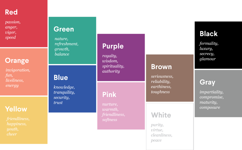
Blue and black’s high associations with serious, subdued, and classical traits matches up seamlessly with our legal clients’ requests and the industry leaders’ choices. Likewise, the absence of orange seems reasonable, as it goes against many of the favored traits.
The prevalence of red in the industry is harder to explain, since it acts counter to sophistication and is one of the loudest color choices. Most likely, red’s popularity reflects the desire for law firms to appeal to younger markets—it is, after all, one of the most youthful colors. It’s also worth noting how red is the color of vigor and power, and everyone wants a powerful legal team behind them.
The prevalence of red in the industry is harder to explain, since it acts counter to sophistication and is one of the loudest color choices. Most likely, red’s popularity reflects the desire for law firms to appeal to younger markets—it is, after all, one of the most youthful colors. It’s also worth noting how red is the color of vigor and power, and everyone wants a powerful legal team behind them.
How you can use legal branding colors to improve your business
The perfect law firm logo colors work in conjunction with the overall branding strategy. The colors you choose should further your branding goals, whether they’re the same as the industry leaders or not.
For smaller law firms, we see a lot more flexibility in their choices, and also that they’re more accepting of more than one brand color. That leaves these firms more freedom to branch out in what their logos can do, such as a noticeable inclusion of orange and yellow. That said, there are still quite a few consistent themes shared with the industry leaders.
-
Andrew Pickett Law logo by okdesignstudio.
-
Due Process Institute logo by Hbrand™.
-
Oppenheim logo design by pecas™.
The logo for Andrew Pickett Law, for example, uses a familiar shade of blue with neutral accents for both the pictorial logo and the word “law.” However, the most noticeable deviation from the standards of law firm logo colors is the usage of orange, which goes against the serious and subdued traits other firms value. This choice seems more appropriate considering that orange has strong associations with youth, and also that it contrasts well with the blue, making a more visually dynamic logo.
The Due Process Institute also takes advantage of the dark blue for professionalism and seriousness, but pairs it with an darker gold. A normal yellow might go against the usual values of the legal industry, but at darker shades, gold actually fits the classical theme well. This classical effect is furthered by the pillar and scales imagery in the logo (done in a modern style, interestingly enough), taking this logo into levels of “classical” that even the industry leaders haven’t touched.
Oppenheim also takes advantage of the classical gold, and complements it with a dark red. Deepening the red subverts the loud properties of the color, while holding on to its beneficial attention-grabbing traits. Combined with the yellow, another warm color, this logo doubles-down for a youthful appearance, but the dark shades of both allow it to maintain its seriousness and professionalism.
Of course, knowing which colors most benefit your brand and actually applying them to a logo are two different things. That’s why it’s important to hire a designer who’s not only skilled, but also understands the nuances of designing for the legal industry. Browse through top legal industry designers here.
Blue collar, white collar, purple collar: what are the logo colors of other industries?
Get a law firm logo design now!
Want to know more about how design impacts business?
Subscribe and be inspired by our best tips, trends and resources.
We'll also send you the occasional marketing email and promotion (which you can opt-out of anytime).