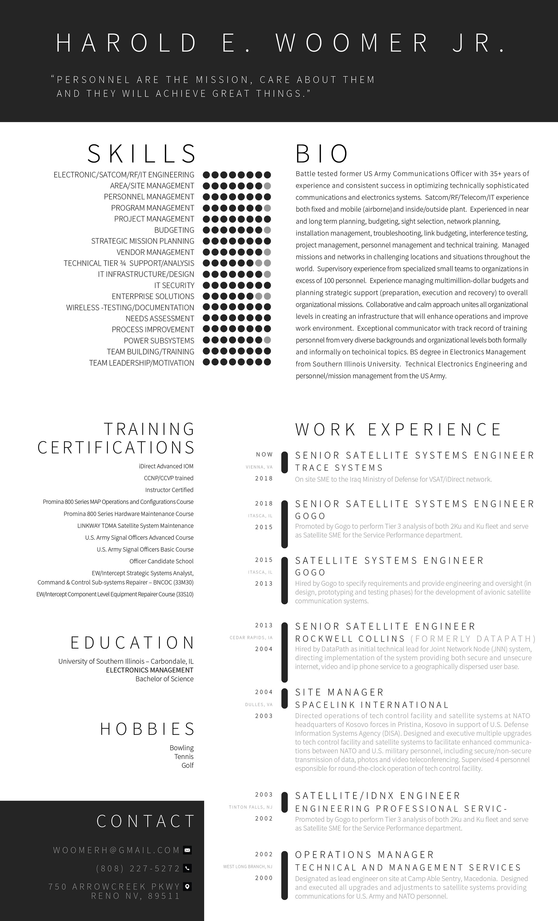

The B&W symbolizes that Harold is pragmatic but the shapes and the layout say that he is able to stand out in those boundaries too.
The dotted indication of Harold's skills attracts the viewer to further examine them.
I decided to keep the work experience brief as HR department tends to have shorter attention spans these days. Also, I put forward the position rather than the company so the consistency of workpositions is maintained.
Military experience can be incorporated into teh timeline if you like but that might downplay your intention of not giving away your age in the first round.
Contact box is located in the bottom to close the CV visually and the viewer will find info easily due to color distinction. It also gives the motto and name resonate on their own in the headline.