
Music streaming services have been divisive since the industry started, because everyone listens to their music in a different way. Hundreds of companies have popped up to cater both to artist and music fans’ niche interests in the marketplace. The industry has been hot lately; there’s a lot of competition – and more to come. Jay-Z and fellow celebrity musicians just released the high-fidelity, “artist-powered” streaming service Tidal, which is making us all take another look at the services that we choose to use.
After the noise we’ve been hearing about Tidal’s “theft” of Spotify’s UI, we thought it would be interesting to compare some of the most widely used music services. These are intricate sites with complicated interfaces, so we narrowed it down to either the web or desktop version (don’t even get us started on mobile app design) and a default home page. Here are our thoughts.
Spotify: The overachiever
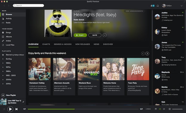
The original dark horse of the game, Spotify embraces a background in shades of slate gray and white text, with activity popping out in a lime green. It’s bold, but the darker hue draws your focus to the album and playlist imagery, which appears more saturated.
In usability, Spotify puts the emphasis on browse features that consistently surface new music. There’s a banner for featured playlists and artists, with a collection of relevant curated lists below. Then it frames the application on all 4 sides with segmented features that users employ most often:
- Left: Sections for your personal curated music collection — your library and playlists
- Right: A feed of the activity for accounts that you follow
- Bottom: The actual music player, so you can see what’s currently playing and your controls surrounding it
- Top: Your profile information and personal notifications
There’s also activity when you move your mouse through the interface. Tools like a “+” sign to add a song or playlist to your library, or a play button to immediately get into the music.
rdio: The minimalist
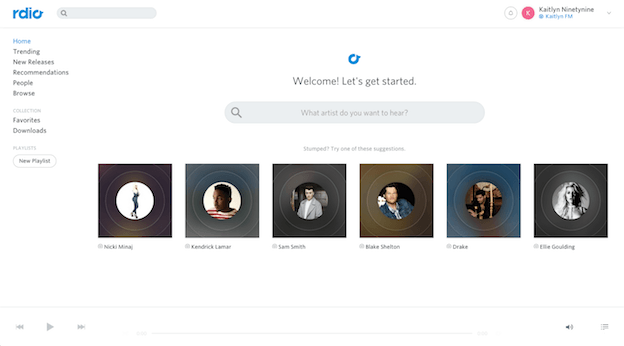
rdio’s sophisticated use of white minimalism draws your eye to the gallery of album artwork. Functionally, it places emphasis on a search feature, with a backup of suggested artists if you don’t know what you’re looking for (and to give the page a little pizzaz).
The music player blends seamlessly into that dominant whitespace, that horizontal strip at the bottom of the page. And there’s a simple menu on the left side, where a user can browse through two main sections:
- A curated list of new music to discover that’s split up into trends, new releases, recommendations, people (who you follow) or a generalized browse
- Your personal collection of music, split into favorites, downloads or playlists
The profile and notification information is on the traditional top right, with a fun addition – a radio station based on your personal music library.
Beats Music: The artist
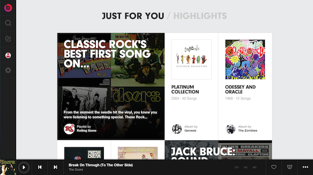
Beats Music is a design darling. But while the majority of its functionality resting in app form, we’ll cover their website UI for consistency’s sake.
What jumps out for us in this design is how they’ve played with the combination of text and the gridded format. By nature, so much of the artwork in these interfaces is square, stemming from the history of the album cover. Yet Beats manages to play with those squares in a way that’s not so rigid. Rather, it looks a more like an interactive online magazine.
Functionally, Beats makes it personal by putting emphasis on music that they’ve curated specifically for the user. Hovering over the main image surfaces a play button that, when pressed, brings up the music player in a nice dark flat design running along the bottom of the screen. The navigation on the left – similarly simple, dark and flat – allows the user to search music, access their own library, their user profile and settings.
The only frustrating part of this design is that you can’t modify your library from your computer, you can only play it. The library building is done in the app.
Soundcloud: The community player
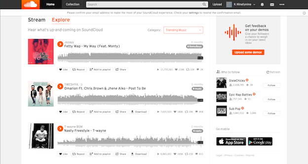
Subscription or library-based music services aren’t the only ways to listen to music these days – and Soundcloud‘s community vibe makes it a strong player in the music streaming business. Its interface combines a couple of the UI concepts that we’ve been seeing often: a lot of whitespace with selective dark toolbars and a super-bright featured color to make page actions pop.
This interface has a lot going on, but if you can overlook the blips of orange, the real feature of the page is the unique way that the service plays music.
- An infographic-like media player that indicates user interaction along the way
- Social functionality to “like,” comment or share songs is right up front, as are the stats for those who have already done so
- The ability for artists to tag their songs
The main toolbar reaching across the top is fixed in place as you scroll, and allows the user to access their personal information and music collection, as well as search for music and upload their own. The toolbar to the right of the page has a call to action to get feedback on your music, as well as a suggested list of who to follow on the site.
iTunes: The media giant
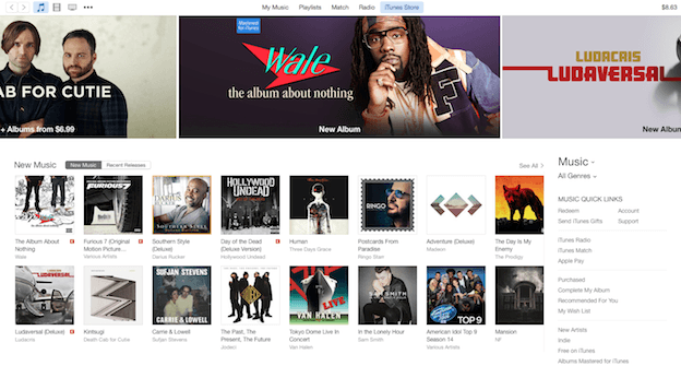
iTunes player is pretty much the original music-master here, but their service differs from the others on this list thanks to their song-by-song purchasing model. Keep in mind, their goals aren’t always in line with a lot of the players on this list. I opted with selecting the shop-able store for our example here. Although it sells much more than music, it follows a common pattern for media discovery.
White provides the backdrop for this interface, but there’s not so much white space here as in many of the others. At least a third of the space you immediately see focuses on bright imagery pushing a curated list of music, one that’s not adapted for specific users. Underneath those ad banners, you can see the album-based grid of new music available for sale.
Most usefully to the right, there’s a navigation allowing for the search for more personalized services, like radio, recommendations, wish lists, etc. All of this is well and good, if not dated. But since Apple owns Beats, there have been a lot of whispers about a merger between it and iTunes. It’ll be interesting to see how these two progress.
Pandora: The radio player
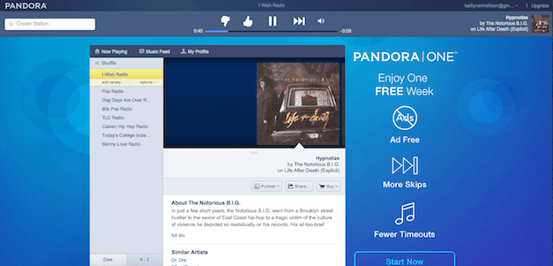
A huge part of music streaming services is the online radio player and Oakland’s Pandora has been at the head of this pack for years. It’s got that beautiful, bold blue that changes shades depending on when you log in. It’s the only service in this collection that features a dominant color that isn’t grey or white.
Pandora’s got a pretty unique experience, as far as this group is concerned. It has a double-layer toolbar at the top, along with the music player, which is usually featured at the bottom of almost every other player. As the dominant visual feature, it has a contained radio player against the background, that takes up only about half of the width of the screen.
It has nearly all of the information you’d ever want:
- Links to playing now, a music feed, and the profile
- List of your personal radio stations, sortable by date or alphabetically
- Horizontal scroll of the current station, including album artwork and information, artist background, and similar artists
- Buttons to publish, share, or buy music
It’s simple and compact, giving the user a lot of options for what to do and focusing screen space on what matters.
The only problem is the ad space on the right, which moves between all sorts of crazy ads. We get why it’s there, but it’s distracting from the simplicity of the rest of the page and (frankly) it’s kind of ugly.
Tidal: The new guy
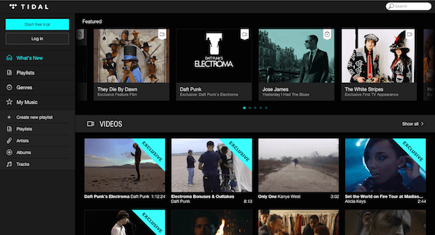
Tidal is the newest player to the game and the last on our list. In a color scheme that (we must admit) is quite similar to the first service featured in our article, there’s a background in shades of dark gray with white text and a bright color for emphasis and action.
The user’s focus directs to the featured artists, gridded up in a refreshing rectangular mode rather than squares. There are icons indicating the media type of file — video versus audio. Additionally there’s a scroll-over functionality where the text listed underneath the imagery features the artwork and artist title, but when scrolled over it changes to the word “play” or “watch” with a bit of additional information overlaid on top of the image.
To the sidebar, Tidal does share a lot of the same options as Spotify, but keeps it a bit more simple. There’s the link for the brand’s curated new music, playlists, and genres, and then a selection for a personal music library and playlist section.