If you are an illustrator then website design just might be the perfect field for you! Incorporating illustration into a website has advantages most standard websites — based on photographs — do not.
Not only does the designer get to use their creativity and imagination but the company gets a completely original look. That’s why most creative industries such as fashion, culinary, gaming or graphic designers use illustration on their websites — if you want to stand out from the competition, then illustrate! 🙂
On the other hand, illustration is rarely implemented into content-heavy sites such as news sites. This is mainly due to the fact that most content heavy sites do not want to confuse or distract readers from their content.
In the following tutorial, I will use Photoshop to show how I illustrated a website design for a Mexican food company. Let’s break this down into 4 easy steps.
1. Creating a sketch
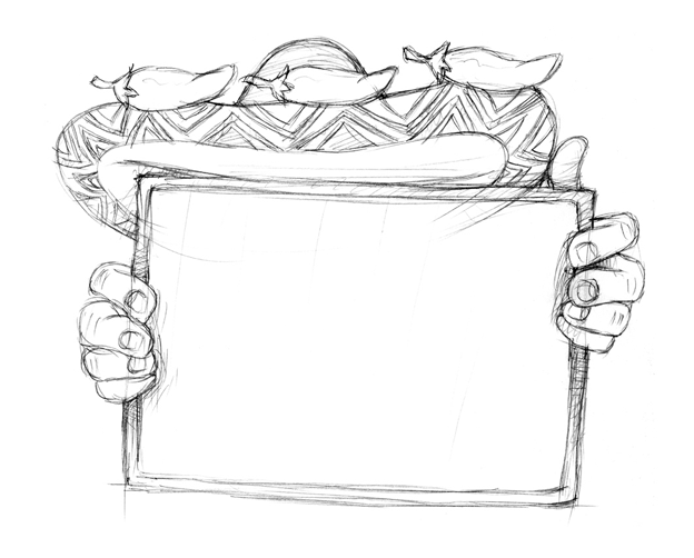
What does sketching really mean? When a designer solves an initial design problem with pen and paper. Some designers like to get detailed with their sketches while others create several thumbnails and different concepts.
Luckily for you, I have already worked through a few concepts for this Mexican food website and arrived at a final sketch. All you have to do is use it as a reference.
2. Vectorizing your sketch
We’ve completed our sketch, now it’s time to vectorize it. Since this is a website, I am using Photoshop — a raster program. However, if you are a logo designer you should only use Illustrator because it’s a vector program and can be scaled indefinitely.
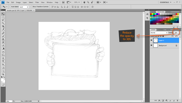
Let’s create a new document and place our sketch into it. We want to make the sketch thin so the path lines we create are visible. We will do this by lowering the opacity value to 30%.
Where should we start vectorizing? It’s up to you! I am going to start with the chili pepers and use the Pen Tool to path each section:
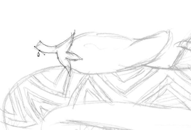
After you’ve outlined your shape, select path and fill it with a basic color using the Paint Bucket Tool (alt + Delete).
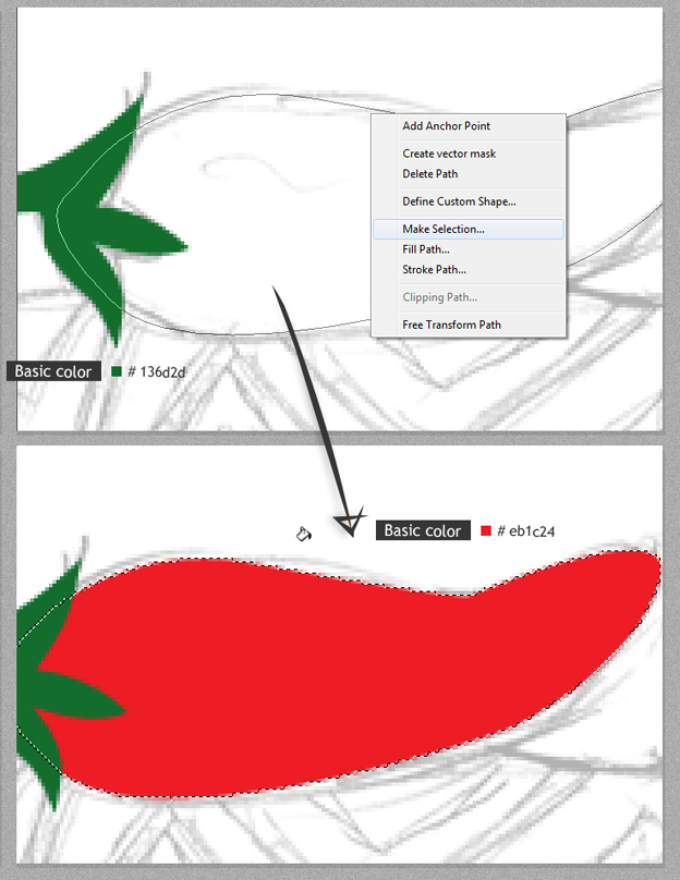
Deselect the highlighted path by right clicking and clicking Deselect.
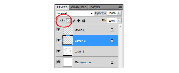
On the Layers palette click the Lock Transparent Pixels so when you start the brush stage you will only make marks on the actual image (and not the transparent background).
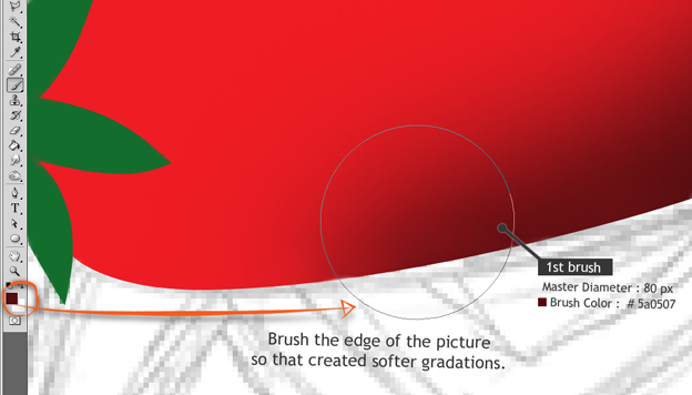
Let’s take more dark colors and brush the edge of the image so we create soft gradients.
Use a smaller diameter brush and a lighter color for the second gradient highlight.
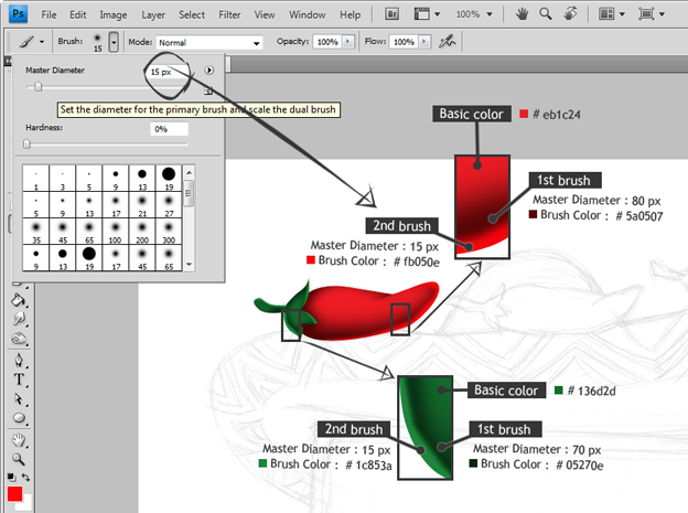
Note: the size of the brush diameter in the picture above is not a specific size, you can enlarge or minimize it so you feel comfortable using it.
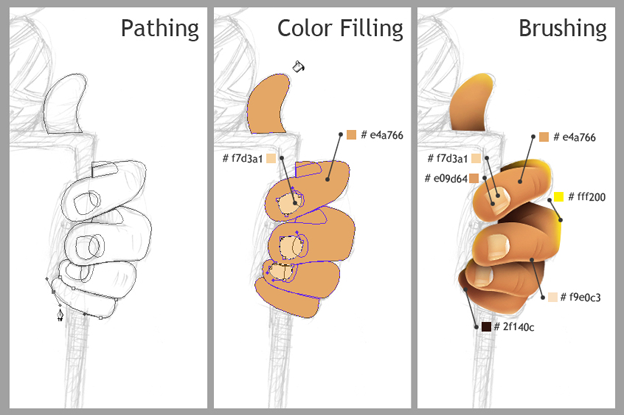
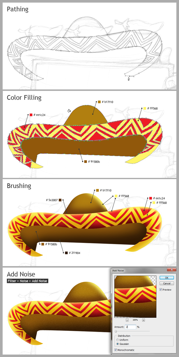
We are going to repeat all above stages for the hands and Mexican hat:
- Creating paths (Pen tool)
- Filling with color
- Brushing in shades and highlights
Don’t forget to create a new layer for each section!
3. Incorporate different textures
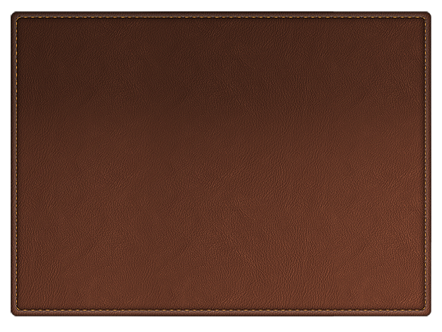
I have prepared the following textures and images for my specific design. There are tons of textures that you can find online to fit your specific project’s look.
Texture 1:
Texture 2:

Texture (image) 3:
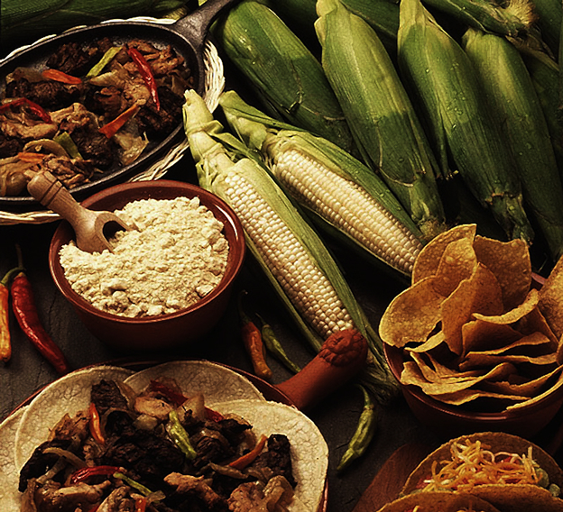
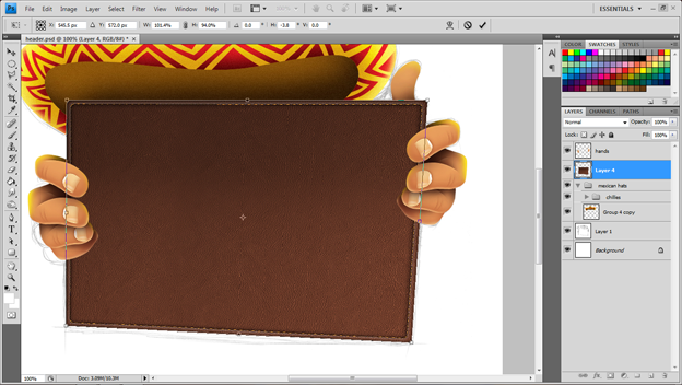
After placing Texture 1 into my document, I’ve enabled the Free Transform tool (Ctrl + T) so that I can fit the texture into my illustration.
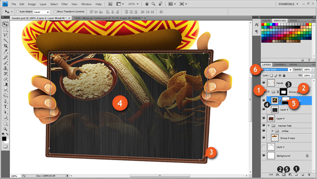
There are a few more steps for Textures 2 and 3 (see image below for number details):
- Create a new Group in the layer palette
- Click the Add Vector Mask icon and mask the group
- Mask Texture 2 and transform 2 and 3 to fit the image
- Add Texture 2 and 3 to the Group
- Mask Texture 3 and create a gradient over it
- In the palette layers, change blending mode for Texture 3 from Normal to Lighter Color
4. Creating a background and adding text
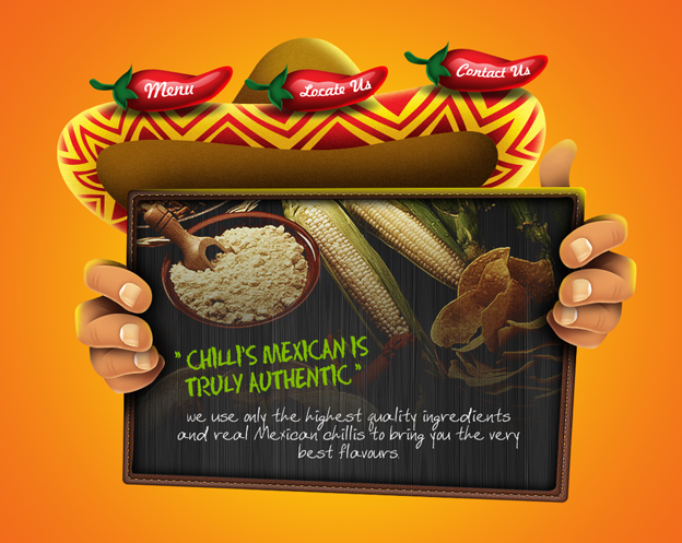
Now it’s time to make final tweaks to our website:
- Background: I’ve created a radial gradient that fades from the color #f05c1e to #fff200
- Add text: for the navigation bar I used font type Freehand BT 521; for the white menu text I used font type FINTRYPARK with the color #ebebeb; for the lime green font I used Chalk Dust Condensed with the color #7fb900
- Final touches: I gave shadows to the chilis and hands and put a glossy touch on the chilis and clipboard
Here is the final result:
I hope you enjoyed my step-by-step tutorial on sketching and vectorizing a website design — I think I’ll go eat some Mexican food now. 😉

